Figma Changelog Review
Changelog
Channels:
Engagement
A high-level overview of the changes, improvements, and new features.
Engagement
A high-level overview of the changes, improvements, and new features.
Engagement
A high-level overview of the changes, improvements, and new features.
Readability
Short descriptions make them easy to read and allow users to follow links for more detailed information.
Readability
Short descriptions make them easy to read and allow users to follow links for more detailed information.
Readability
Short descriptions make them easy to read and allow users to follow links for more detailed information.
Job-to-be-Done
The focus on high-level user benefits, guidance on how users can utilize it.
Job-to-be-Done
The focus on high-level user benefits, guidance on how users can utilize it.
Job-to-be-Done
The focus on high-level user benefits, guidance on how users can utilize it.
Personalization
Updates are segmented according to tags.
Personalization
Updates are segmented according to tags.
Personalization
Updates are segmented according to tags.
Multimedia
The creative use of illustrations, GIFs and videos.
Multimedia
The creative use of illustrations, GIFs and videos.
Multimedia
The creative use of illustrations, GIFs and videos.
Design
Simple block divisions, accompanied by engaging media, explanatory headings.
Design
Simple block divisions, accompanied by engaging media, explanatory headings.
Design
Simple block divisions, accompanied by engaging media, explanatory headings.
Delivery
An effective way to communicate a new feature within the app.
Delivery
An effective way to communicate a new feature within the app.
Delivery
An effective way to communicate a new feature within the app.
Navigation
Easy to navigate between blocks, pages and topics.
Navigation
Easy to navigate between blocks, pages and topics.
Navigation
Easy to navigate between blocks, pages and topics.
SEO
Changelogs are indexed by search engines.
SEO
Changelogs are indexed by search engines.
SEO
Changelogs are indexed by search engines.
Accessibility
The content and media are optimized for mobile and small screens.
Accessibility
The content and media are optimized for mobile and small screens.
Accessibility
The content and media are optimized for mobile and small screens.
Actionable
Contain all ways: to education, benefits and sales.
Actionable
Contain all ways: to education, benefits and sales.
Actionable
Contain all ways: to education, benefits and sales.
Archive
Release Note archive is available on the page and in-app
Archive
Release Note archive is available on the page and in-app
Archive
Release Note archive is available on the page and in-app
Localization
English, German, French, Japanese are available.
Localization
English, German, French, Japanese are available.
Localization
English, German, French, Japanese are available.
Multi-channel
Updates are distributed through various channels, including app and social networks.
Multi-channel
Updates are distributed through various channels, including app and social networks.
Multi-channel
Updates are distributed through various channels, including app and social networks.
Based on a book Release Notes People Actually Want to Read.
Figma offers a comprehensive approach to release notes, dividing them into: "Release Notes" and "What's New." Additionally, there's a dedicated launch event where Figma showcases their major features. What's New is highly visual and serves as a high-level marketing showcase for significant updates. Release Notes page provides traditional release notes, focusing on individual new features or improvements. It offers a high-level overview of the changes and summarizes the most important enhancements. The published launch combines feature announcements with educational resources like instructions, libraries, lectures, and demo frames. This creates a smart and informative experience for users.
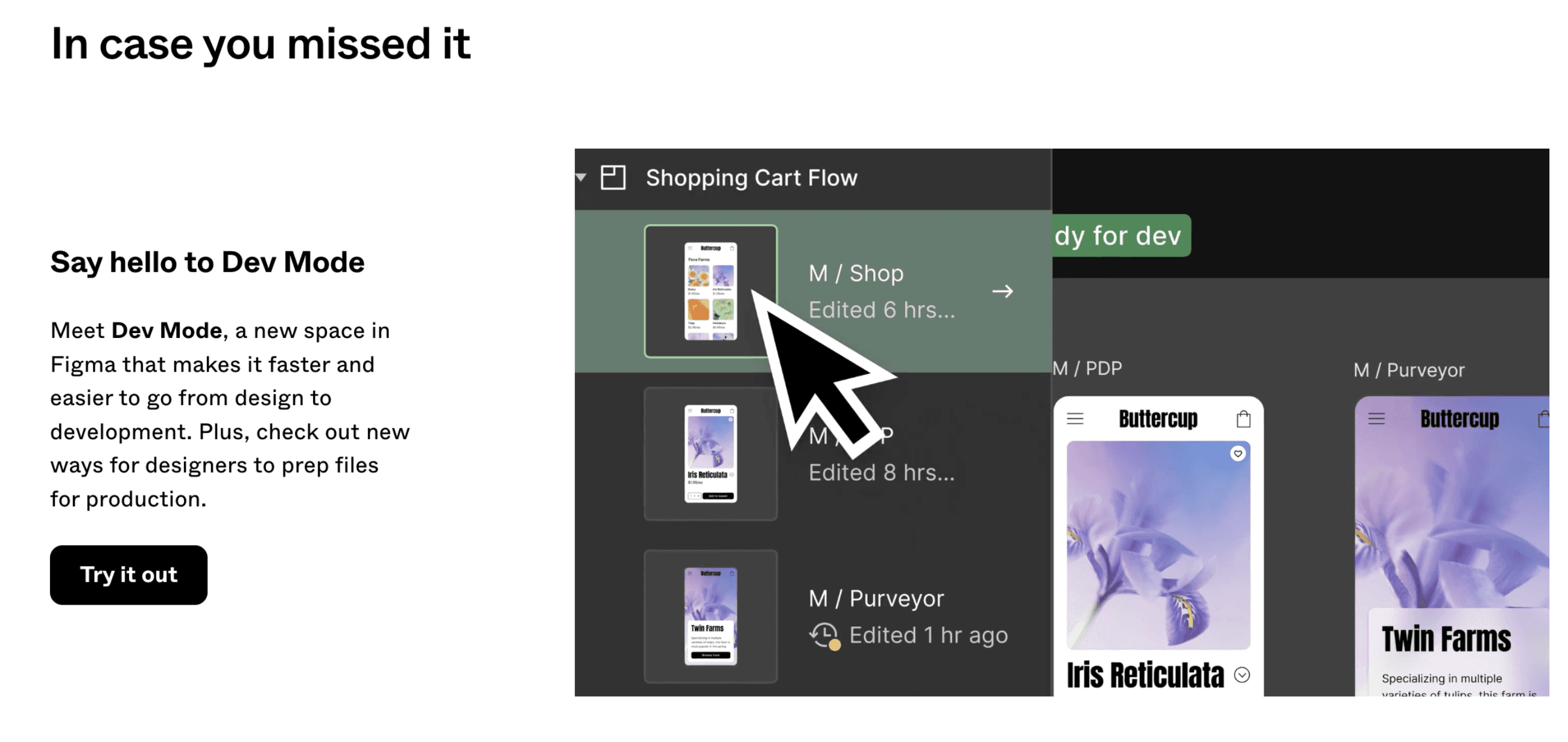
Lessons to Learn
Let's look at all of Figma's announcement pages. You can take some excellent practices and examples from them to onboard your customers to new features with fascinating media and actionable links, facilitating visual learning of the new feature in your account. It's always very interesting and exciting to check its announcements, as they are highly engaging and encourage you to try the new feature right away.
Multi-faceted Education
Figma employs an effective method to capture users' interest and encourage exploration of updates. Demo templates, playgrounds, canvases, and more allow users to immediately see the new feature in action and experiment with it in various ways.
Demo playgrounds:
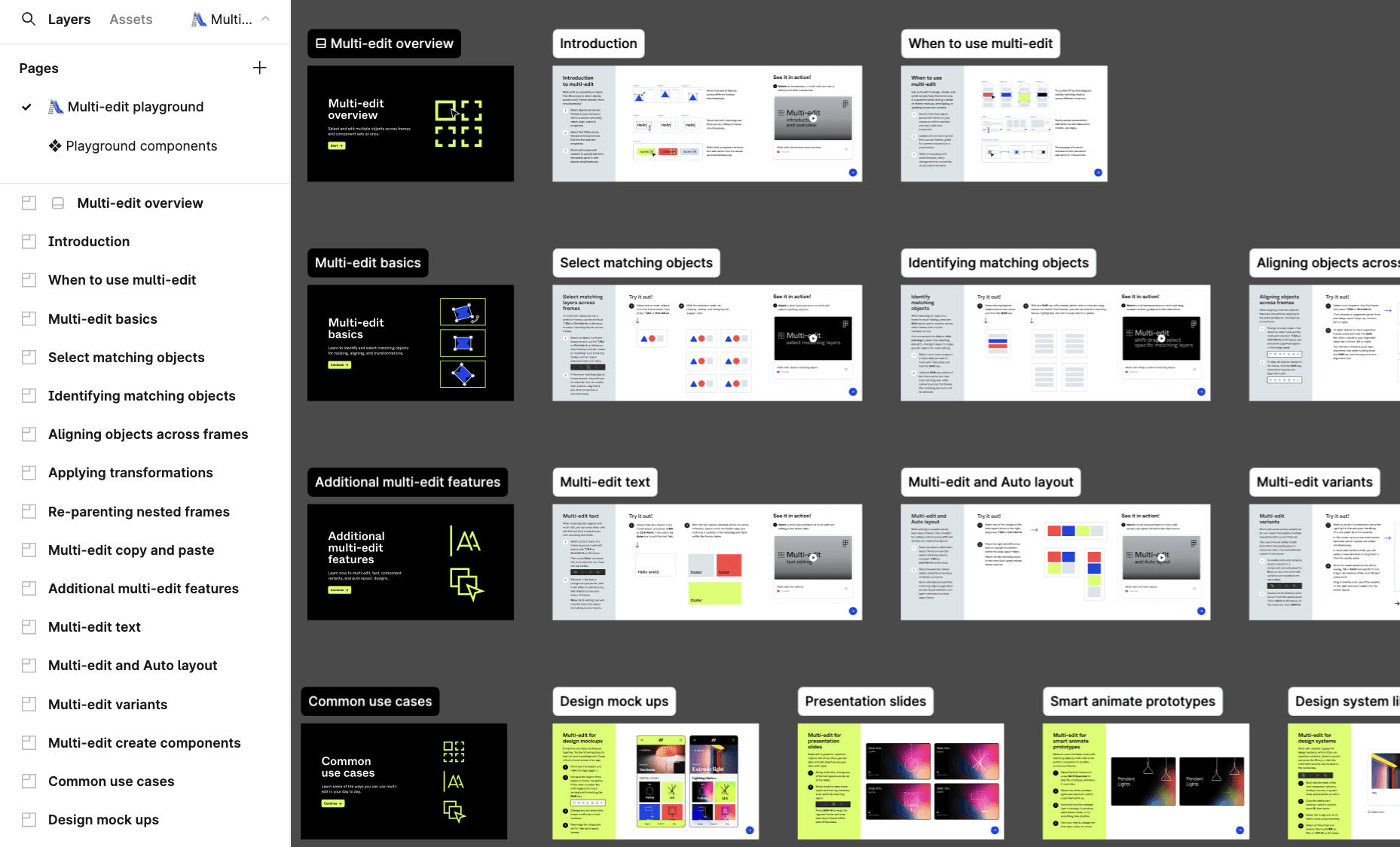
For example, when reading about the feature of editing multiple objects, you can try it out now. As you open it, you'll find yourself in your account with step-by-step educational frames. Each frame explains a part of multi-editing, from the basics to advanced techniques.
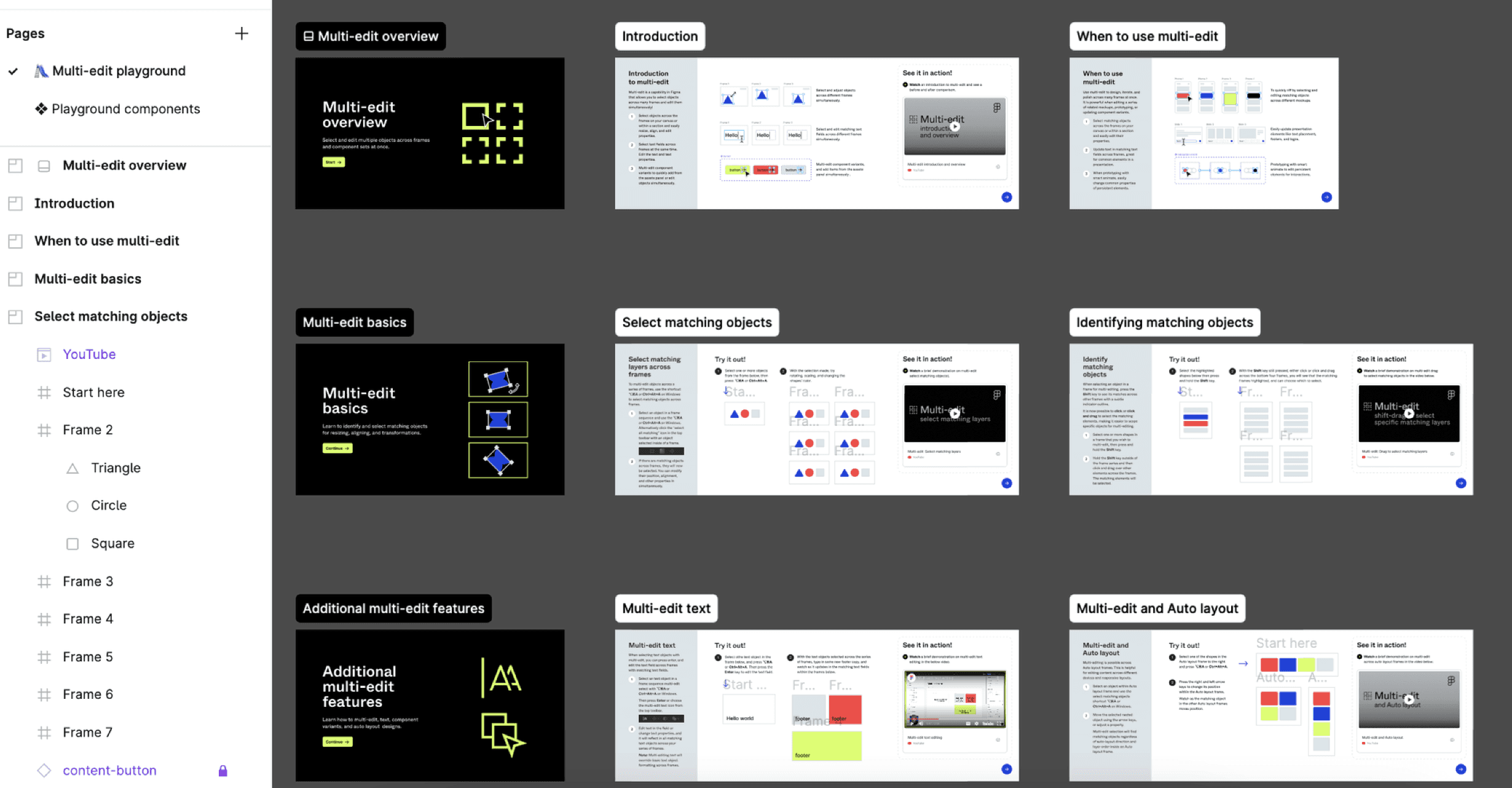
Each frame contains instructions and a video demonstrating how to use it.
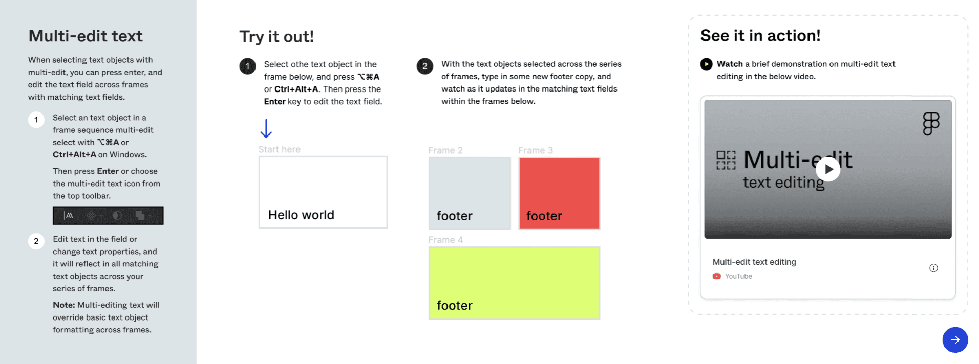
You can experiment with these options right now while watching to the explanations.
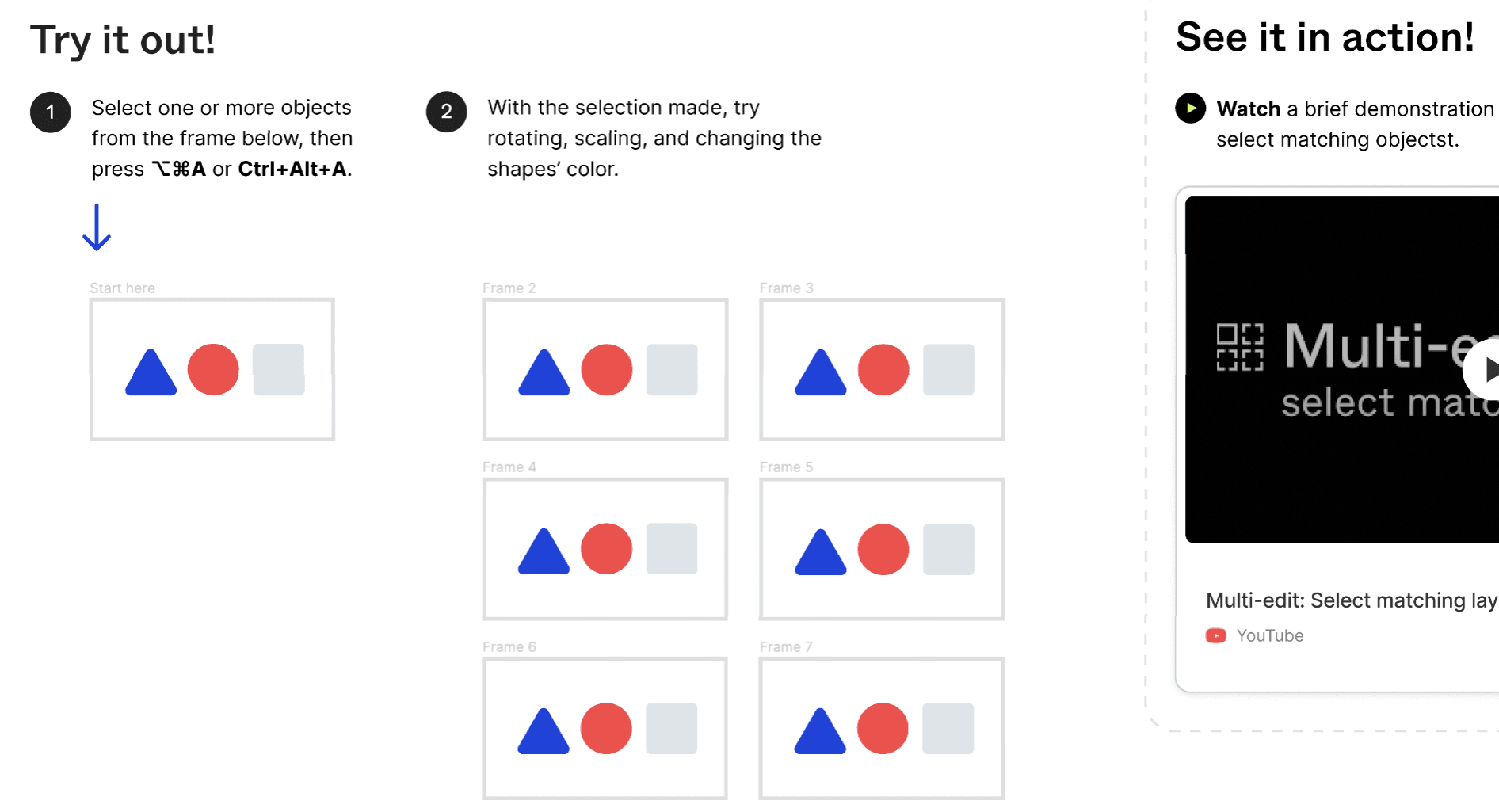
Utilizing predefined settings, templates, and frames is an excellent way to explain the new feature and, furthermore, motivate users to try it out. Presenting it in a playful manner makes the task easier and more enjoyable.
Talks and discussions:
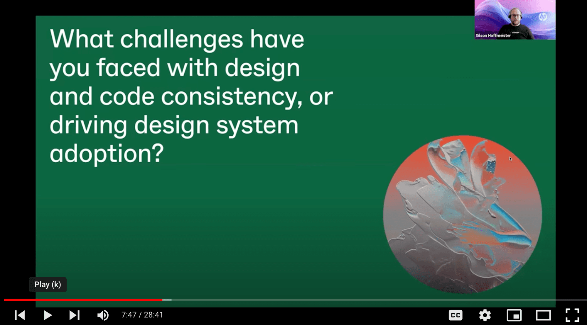
In the block about Code Connect there are links to go deeper, and also link to YouTube to explore common issues faced by design systems teams, like ensuring consistency between Figma and code, and discuss new solutions like Code Connect.
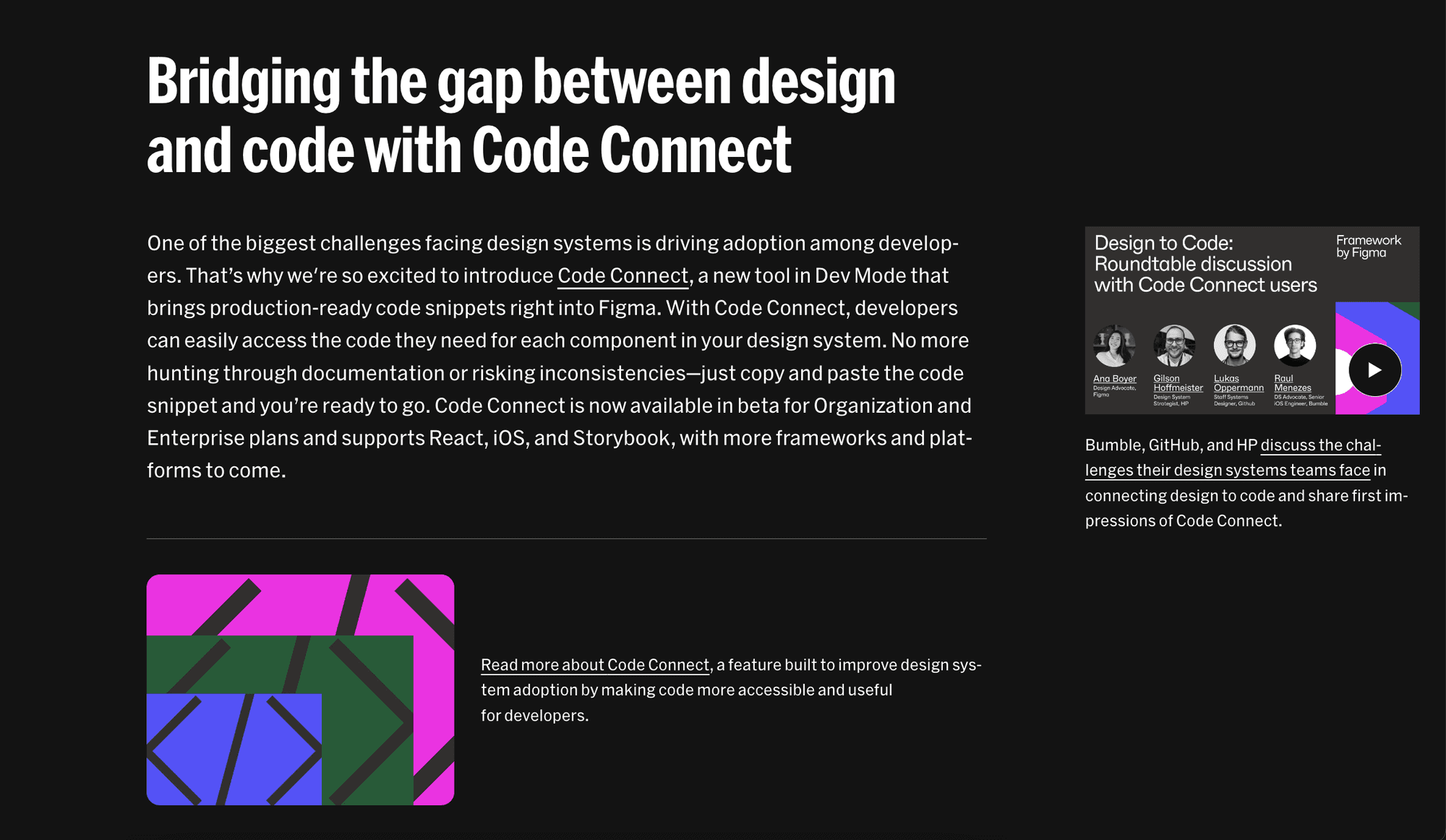
It is a way to more deeper immersion in the topic understanding the pain and the benefits of the solution.
Deep video demo:
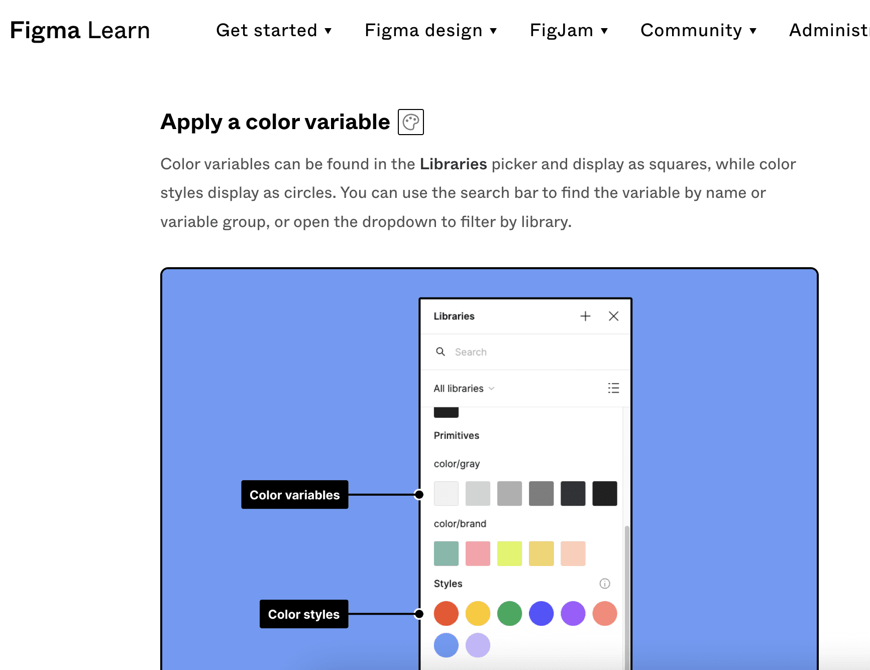
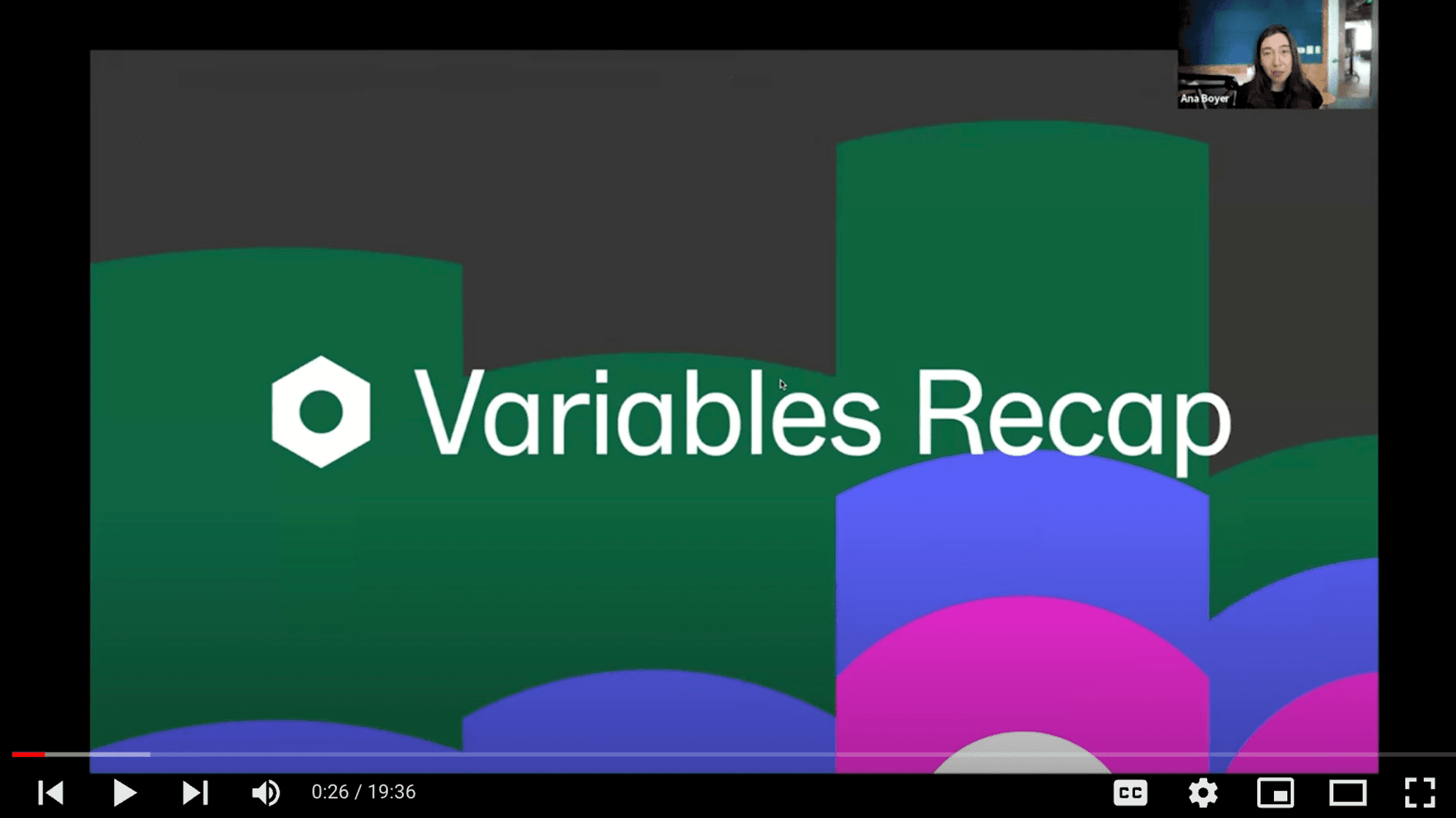
In the review of the ‘Framework: Typography and gradients’ there is a link to the YouTube video. Firstly it gives a quick recap of the feature before the release. It is the great way to remind users about usage and benefits.
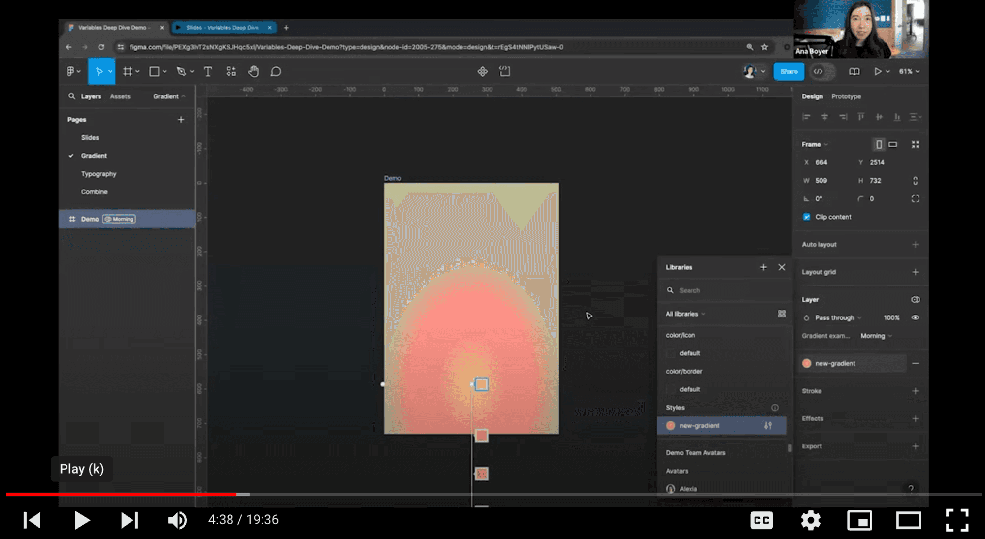
And then there is a part with demo about enhancements or new options.
Readibility and Multimedia Content
As a great tool for designing, Figma utilizes creative illustrations and GIFs. The 'What's New' page is highly visual, featuring descriptions of feature benefits. The concise writing not only helps users understand the changes with minimal effort but also ensures readability and maintains user interest.
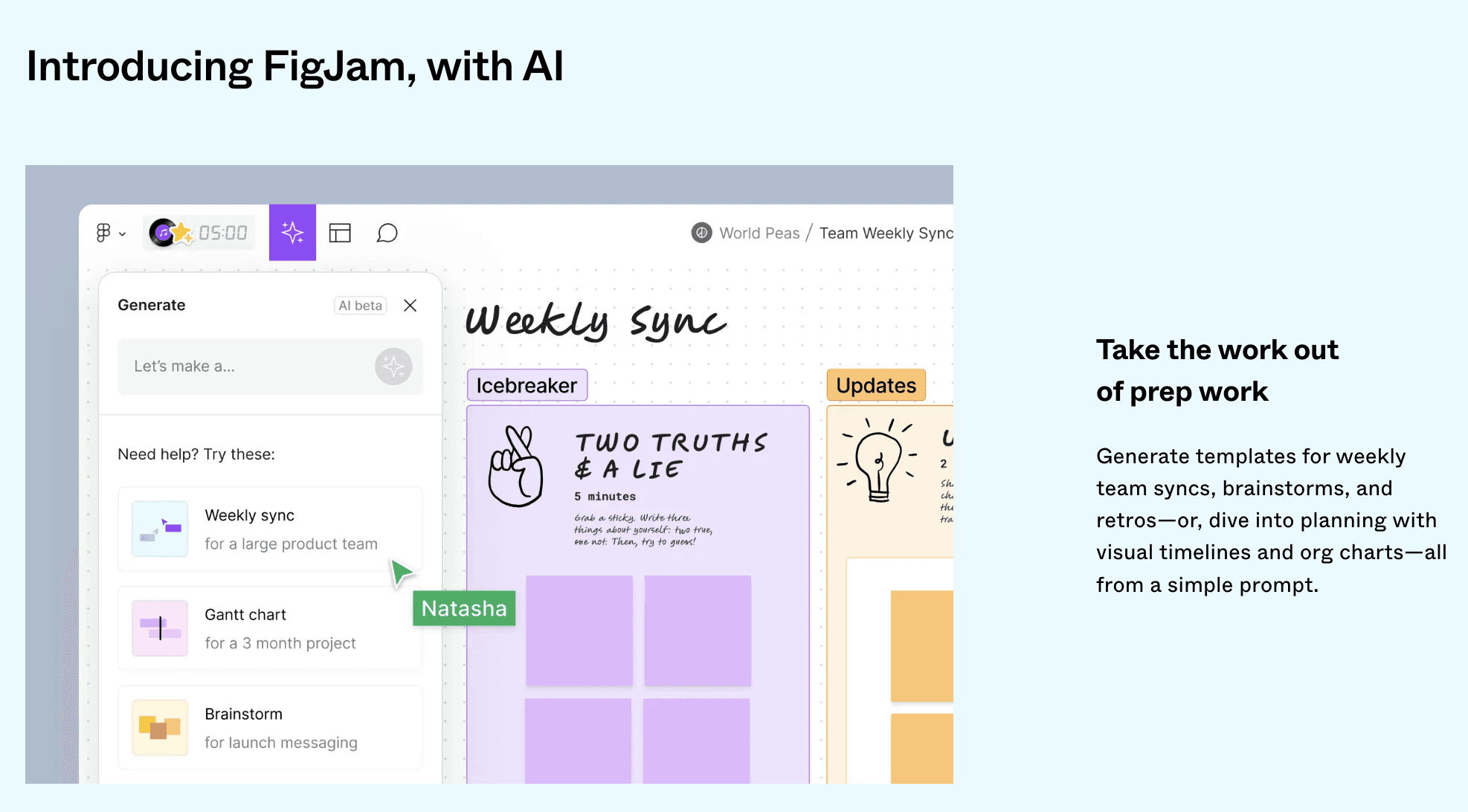
Incorporating pictures, GIFs or videos, not just of the interface, but also displaying the result in a playful manner, makes working with the new feature easier and more fascinating. It’s interesting to read and eager to try.
Create videos and images not just to show where the feature is and how it works, but also to demonstrate the results the user will get.
Delivery
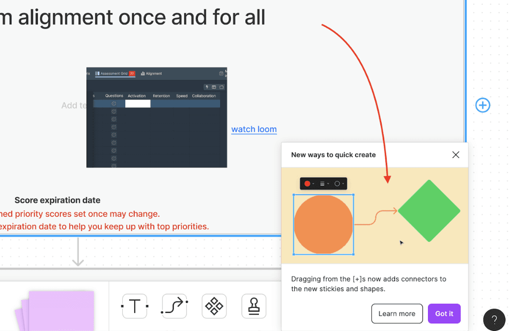
This is a super simple yet highly effective way of communicating a new feature in-app. By giving a modal that explains a new feature and how it can be used, it gives users motivation, knowledge, and the context to nudge them toward actually using the feature.
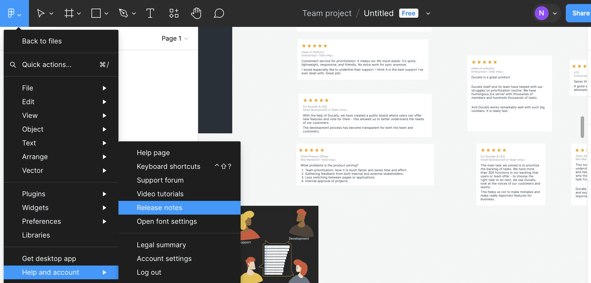
In Figma's in-app launcher, you always have access to the release note section, allowing users to have a self-serve resource at all times and learn as they go.
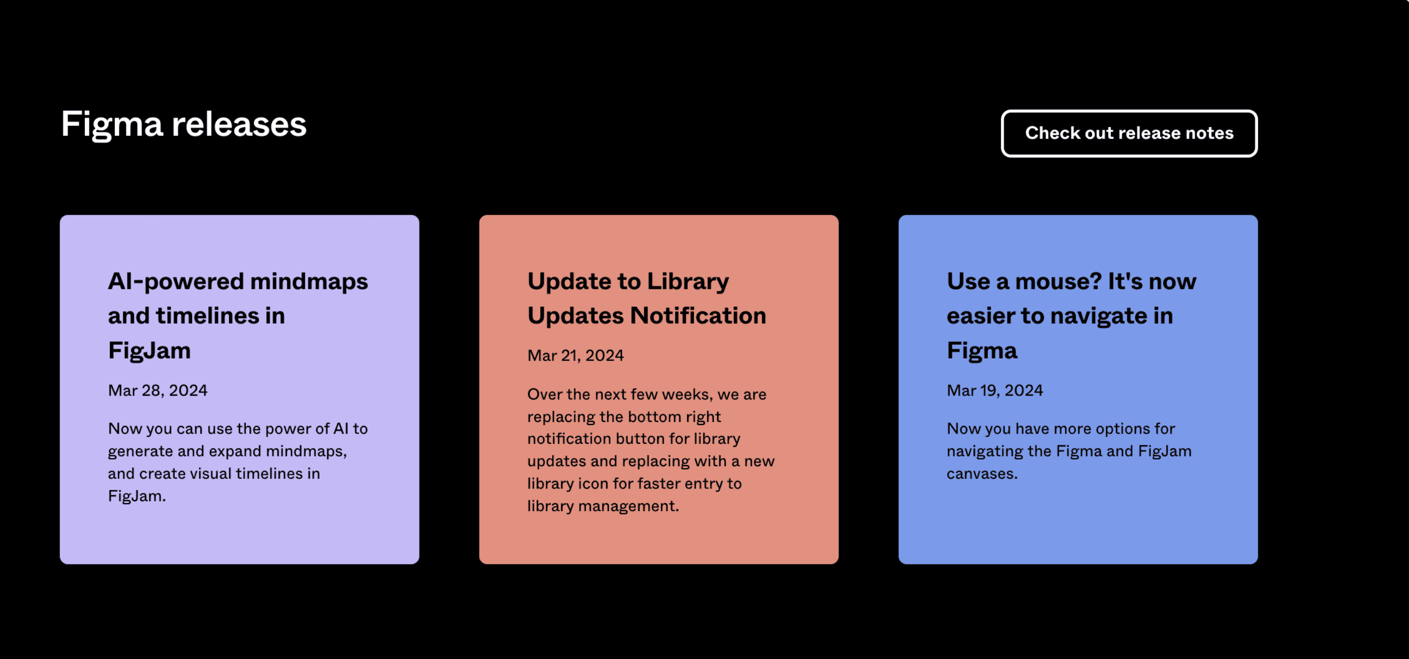
The page also features a well-organized Release Note archive. You can easily navigate to this section and explore all updates. They are arranged chronologically.
Seamless User Journey to Sales
Guide users from initial announcement to understanding the benefits and ultimately, potential purchase.
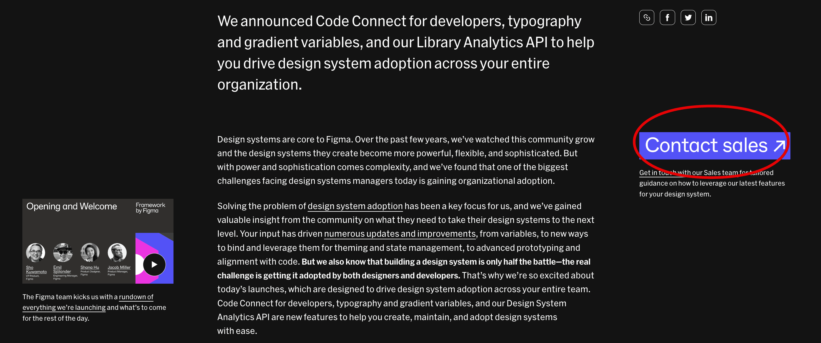
The launch begins and ends with a call to action directing users to contact the sales team. As you start reading the review, you'll notice an eye-catching yet unobtrusive button.
Make it easier to find the update
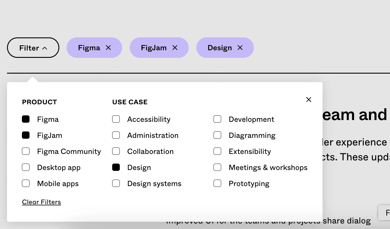
This page allows you to find what you need. That is mainly because the categorization system with filter and tags, making it easier for users to see the history of changes being made.
Keep the most important changes in a simple way
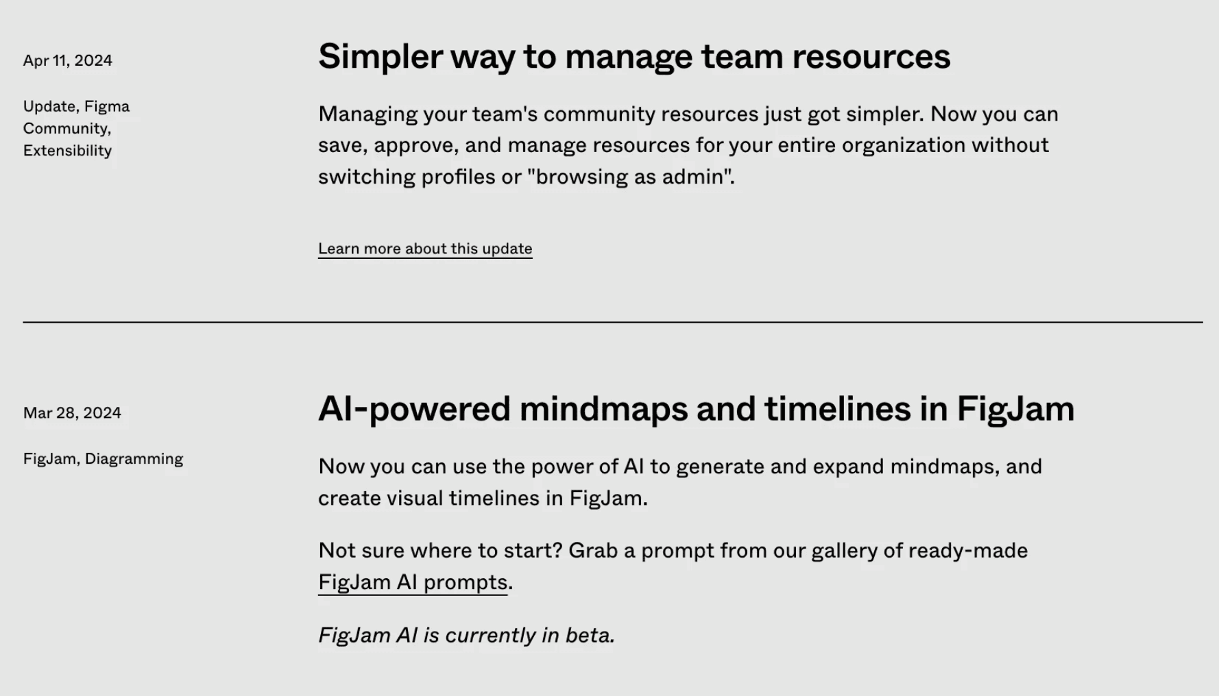
Figma’s 'Release Notes' section provides a high-level overview of product changes.
If you don’t regularly read release notes, but need to figure out something about a product, the Release Notes page is where you start looking.
Figma gathers all their updates in a simple format:
Clear headings
Short descriptions
Direct links to instructions and usage, avoiding overload of the description with this information.
The main goal of this page is to keep all features in one place, providing a clear understanding. If you want to try it, just follow the links.
Reaching every user
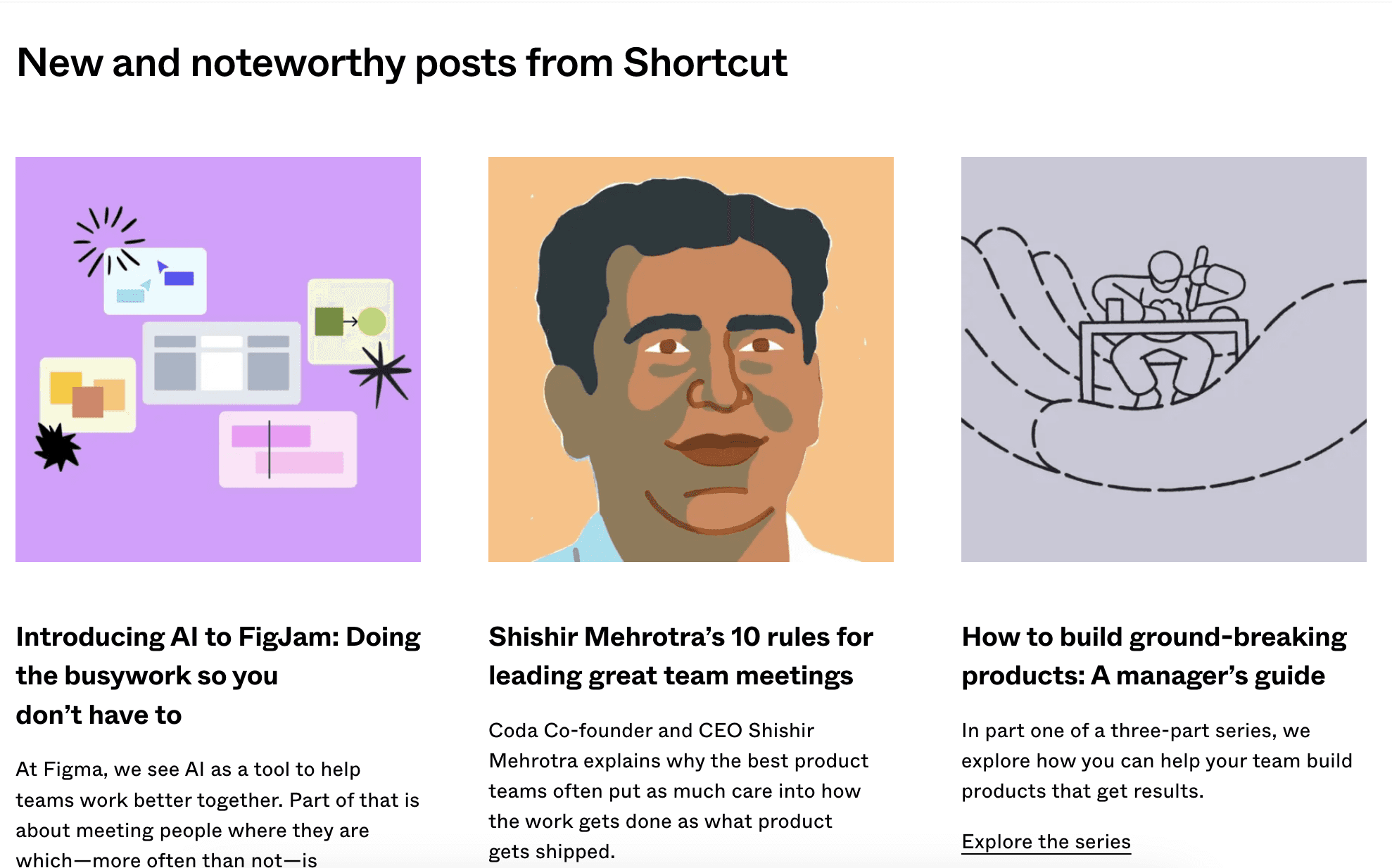
Figma understands the importance of reaching users across various touchpoints. They leverage a multi-channel approach, utilizing emails, social media platforms like Twitter and Instagram, Shortcuts blog, the Figma forum, their What’s New and Release Notes, and even YouTube to ensure maximum exposure.
Areas for Improvement:
Enhanced Search:
While Figma's launch content is comprehensive, the search functionality within the launch resources could be improved. This would allow users to easily find specific information or revisit features they encountered earlier.
Spread the world about features
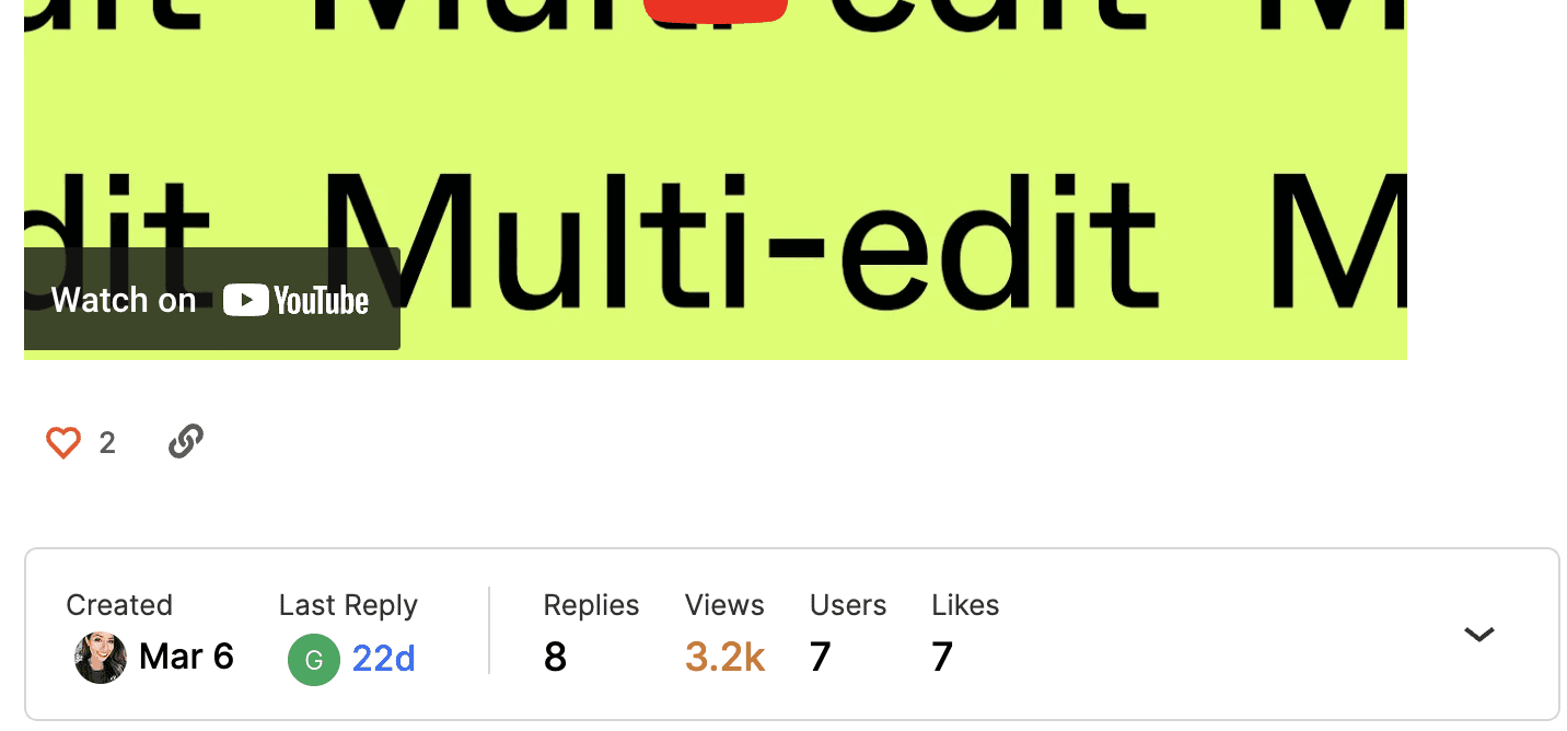
Figma has a Community Forum with likes, reactions, and discussions, along with a shareable link. Knowing how large Figma's audience is, in our opinion, it would receive more replies and comments by providing a link to the discussions near the update itself. Personally, I discovered the Forum much later than I learned about updates.
Subscription
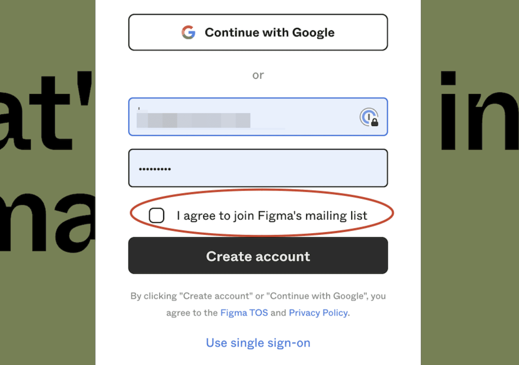
Currently, there is no subscription option for users to receive update notifications. It is only possible to subscribe to all of Figma’s emails while creating an account or logging in. Introducing a subscription feature could provide users with more control over how they receive updates, improving overall user experience and ensuring timely access to new features.
Conclusion:
Figma's launch strategy is a shining example of how to effectively engage and educate users and sets a high bar for the industry with its user-centric approach, multi-channel communication, and a well-defined user journey.
Figma gamifies exploration with demo templates, educational videos, and playgrounds, making it a playful and interactive way to learn and experiment with new features right away. Its exceptional product GIFs, images, and videos captivate users and clearly showcase both the process and the results of new features.
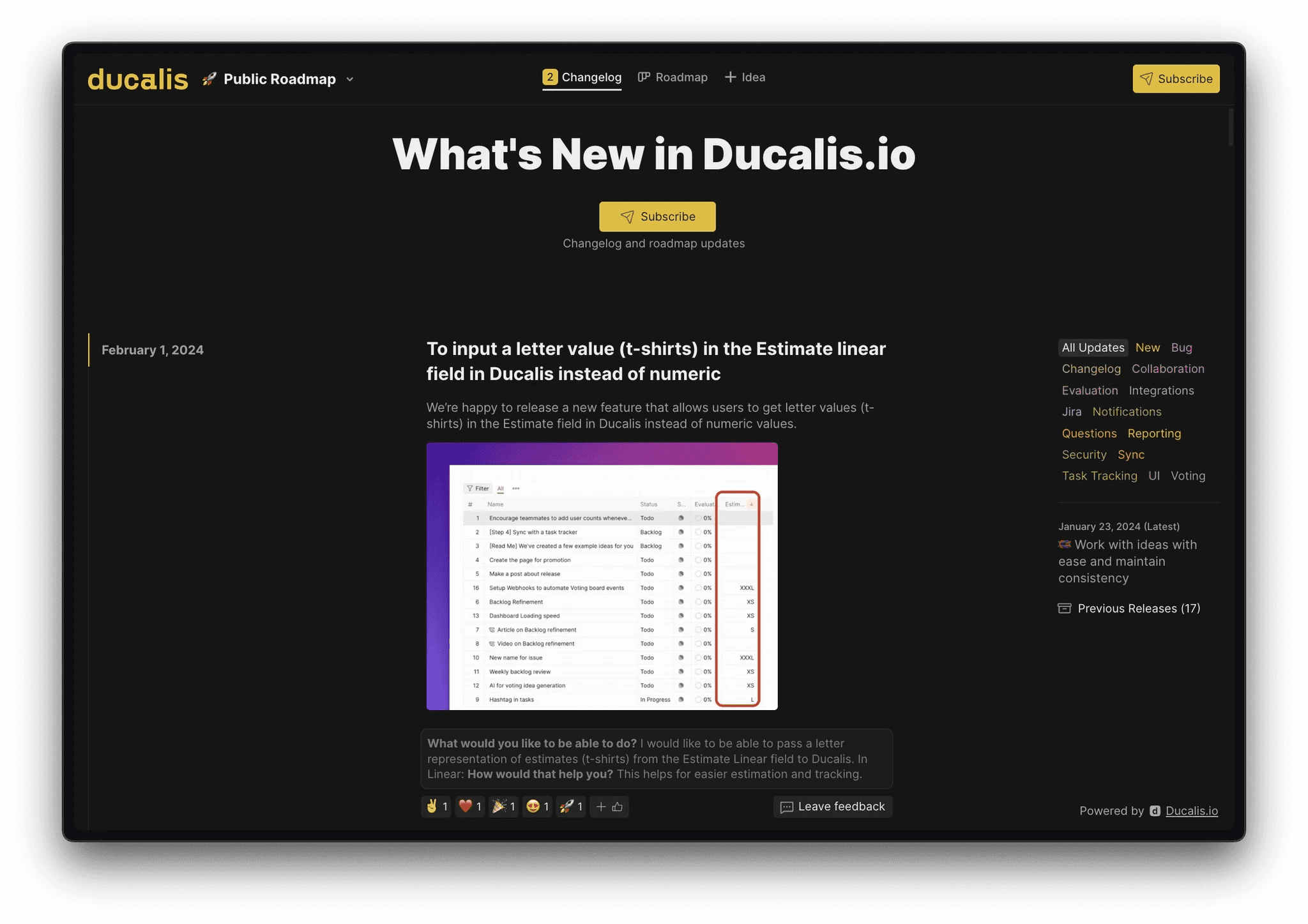
Keep in mind that Ducalis changelogs can streamline your product launch process. Here's how:
Effortless Announcement Creation: Ducalis automates routine tasks like writing announcements and preparing emails with AI-powered writing assistant.
Streamlined Communication: Ducalis offers features like categorization, email subscriptions, and comments/reactions across all channels. This keeps your users informed and engaged, fostering a two-way communication flow.
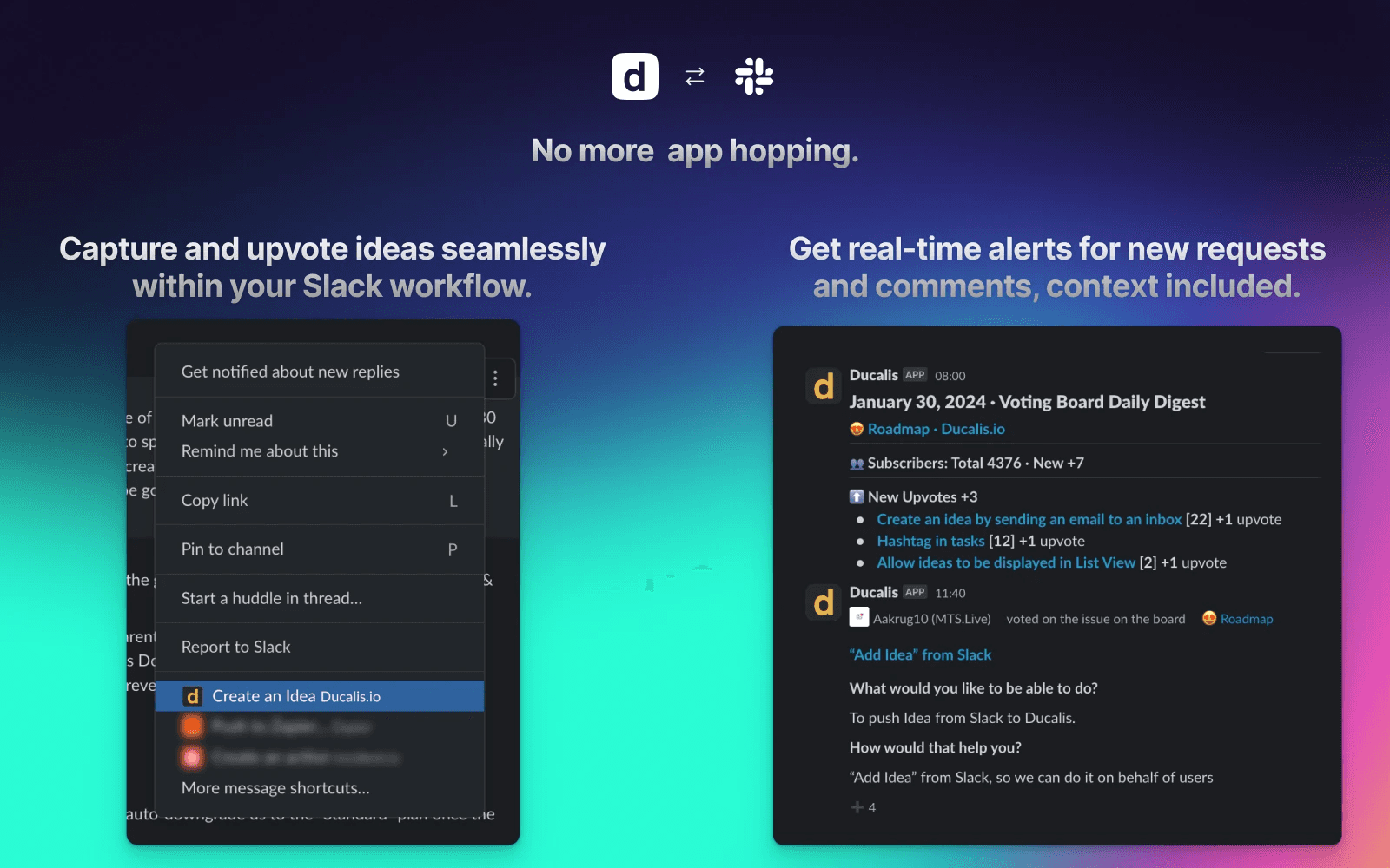
Leveraging User Feedback: Ducalis seamlessly integrates with Slack communities. With a few clicks, you can convert messages and comments into actionable product development ideas. This allows you to directly tap into user feedback and continuously improve your product.
Get Started with Ducalis free changelog tool
We've analyzed hundreds of release notes, and one thing stands out: clear, informative changelogs lead to happier users. Inspired by the best practices in this article, Ducalis offers a free changelog builder tool:
Get Started with Ducalis free changelog tool
We've analyzed hundreds of release notes, and one thing stands out: clear, informative changelogs lead to happier users. Inspired by the best practices in this article, Ducalis offers a free changelog builder tool:
Automagical Release Notes
Ditch Manual Changelogs
save 90% time
Automagical Release Notes
Ditch Manual Changelogs
save 90% time